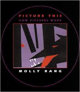
RATING: 9/10…ADDED: September 9, 2014
Why does red feel more passionate and alive than purple? Why do diagonal lines give motion to a picture? Why does a light background feel safer than a dark background? These are some of the many questions Molly tackles in this very clear, memorable, and fun read.
Notes:
How does the structure of a picture affect our emotional response?
How does color affect the picture?
I.E. Red: bold, flashy, danger, vitality, passion
How does size affect the picture?
Notice the positioning of objects
Distance makes the heart grow colder—not fonder.
Diagonal lines give a feeling of movement.
When we want a picture to feel scary, it is more effective to graphically exaggerate the scary aspects of the threat and of its environment than to represent them as close to photographic reality as possible, because this is the way we feel things look.
When two or more objects in a picture have the same color, we associate them with each other. The meaning and the emotion we impart to this association depend on context, but the association is immediate and strong.
PRINCIPLES
Smooth, flat, horizontal shapes give us a sense of stability and calm.
Vertical shapes are more exciting and more active. Vertical shapes rebel against the earth’s gravity. They imply energy and a reaching toward heights of the heavens.
Diagonal shapes are dynamic because they imply motion or tension.
The upper half of a picture is a place of freedom, happiness, and triumph; objects place in the top half often feel more spiritual.
The bottom half of a picture feels more threatened heavier, sadder, or constrained; objects placed in the bottom half also feel more grounded.
An object placed higher up on the page has “greater pictorial weight.”
The center of the page is the most effective “center of attention.” It is the point of greatest attraction.
White or light backgrounds feel safer to us than dark backgrounds because we can see well during the day and only poorly at night.
We feel more scared looking at pointed shapes; we feel more secure or comforted looking at rounded shapes or curves.
The larger an object in the picture, the stronger it feels.
We associate the same or similar colors much more strongly than we associate the same or similar objects.
Our feelings seem to be elicited by the proportion and “perfection” of regularity and irregularity, as well as by what shapes and colors are chosen.
We notice contrasts, or, put another way, contrasts enables us to see.
